
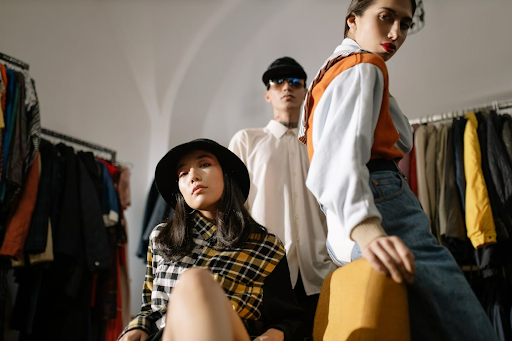
Walk through any store, and it’s easy to spot what’s “new” this season—until the same look feels tired a short time later. That cycle isn’t a failure of taste so much as a feature of how design trends move.
The difference between trend-driven products and timeless design starts with intent. Trending design is built to mirror current aesthetics, from colors and silhouettes to materials that photograph well right now, even if they age poorly as styles shift. It often prioritizes novelty over longevity, so items may read as last year’s idea after only a few seasons.
Timeless design, by contrast, leans on simplicity, functionality, and quality craftsmanship, so the object keeps working and looking right even when the surrounding culture changes. Designers who aim for permanence choose durable materials and proportions that stay comfortable.
That distinction shapes more than a shopping decision. For consumers, it affects cost per wear, repairability, and whether a purchase still feels like “them” years later. For brands, it influences identity, because chasing every micro-trend can blur what a product stands for.
Footwear offers a clear example: Birkenstocks have stayed recognizable because their comfort-first form follows practical needs, not fleeting visual cues.
Fads, Trends, and What Actually Lasts
A fad flares up fast and burns out quickly. It’s usually a novelty detail that spreads through social feeds and fast retail, then feels dated within one to three years.
Design trends move differently. They track wider cultural shifts, such as changing ideas about comfort, sustainability, or work life, so they often shape products for five to ten years.
Timeless design sits outside that cycle by focusing on stable human needs. Good ergonomics, clear controls, and materials that repair well don’t depend on a specific moment, which supports longevity.
Confusion happens because a fad can resemble a trend early on. A neon accent color in home goods may read “fresh” for a season, yet it rarely suits daily use. A broader shift toward warmer, glare-reducing lighting lasts longer because it reflects how people want spaces to feel. Looking for context helps separate signal from noise.
People often treat every new look as proof of durability, then regret the built-in obsolescence. Mislabeling fads as design trends can steer a renovation or product spec toward choices that age out early.
Why Trend Fatigue Is Changing Consumer Behavior
Trend cycles used to feel like helpful inspiration, but many shoppers now describe them as noise. In a consumer survey discussed in this trend fatigue research, about two-thirds of customers reported trend fatigue and said they often ignore trends altogether.
Relentless micro-trends also create decision exhaustion. If a color, cut, or gadget feature is “must-have” for only a few weeks, buyers face constant second-guessing, and purchases can trigger quick buyer’s remorse once the next look takes over.
As a result, consumers are recalibrating what “value” means. They tend to reward durability, repairability, and materials that hold up, along with designs that feel authentic to their routines rather than optimized for a short photo moment.
This cultural pivot changes how brands compete. Companies anchored in clear brand values can rely less on novelty and more on consistency, making products easier to trust across seasons. Timeless principles become a signal that a purchase will still fit, function, and feel current later.
Retailers are seeing this shift in the questions people ask: Will it last? Can it be repaired? Does it suit multiple settings? Products that answer those questions reduce post-purchase doubt, while trend-led items risk feeling outdated before the receipt fades.
The Business Case for Design Longevity
Timeless design is often framed as an aesthetic preference, but it also behaves like risk management. Products that keep their appeal reduce how often a company must refresh packaging, catalogs, and digital assets to stay credible.
Each redesign carries direct costs in design labor, new photography, updated signage, and inventory write-downs. If the underlying brand identity remains stable, those updates can happen on a slower cadence and with smaller, planned adjustments.
Consistency also compounds recognition. A watch brand that keeps its dial proportions and typography familiar year after year makes it easier for shoppers to spot it across retailers, social posts, and resale markets without relearning what it stands for.
Trend-chasing reverses that effect. A logo that shifts with every season, or a sneaker line rebuilt around the latest silhouette, creates ongoing expenses and can blur brand values into a collage of short-term references.
Long-term thinking in design usually pushes teams toward better materials and construction, because flaws show up over time. Furniture makers, for example, choose joinery that can be tightened or repaired instead of glued shut.
That mindset supports longevity in goods like leather bags, where stitching, edge finishing, and hardware matter more than a seasonal color drop. Guides to quality leather craftsmanship highlight what endures. Over time, margins improve and trust holds steady across repeat purchases.
Brands That Prove Timeless Design Works
Apple: Simplicity as Strategy
Apple is often cited because its products rarely look busy, even as technology gets more capable. The company treats simplicity as a strategy, removing buttons, visual clutter, and unnecessary options where possible.
That focus shows up in hardware, software, and packaging that share one visual language. Consistent proportions and restrained colors keep the experience calm. Familiar interface patterns reinforce brand identity without leaning on seasonal styling, and recognition becomes almost automatic because the design system stays coherent across phones, laptops, and accessories.
Patagonia: Values Over Visual Trends
Patagonia proves timeless design can start with ethics rather than a signature silhouette. Its commitment to durability and sustainability influences fabric choices and construction details.
That lens also shapes what the company refuses to make, since some ideas conflict with its goals. The result is gear that keeps working and keeps looking reasonable long after a trend color fades.
Design consistency may look understated, yet it rests on brand values that stay stable across seasons. Repair programs and practical fits signal that longevity matters more than novelty.
Both Apple and Patagonia differ in category and style, yet both show that clarity about what matters guides every design decision. They refine details and performance while keeping core cues intact. For readers comparing trend-built items with long-life choices, that restraint creates familiarity without boredom over many years.
How to Balance Trends With Timeless Foundations
Staying current doesn’t require rebuilding everything each season. Teams can anchor brand identity in timeless principles such as clear typography, balanced proportions, and a flexible color palette.
Core elements should serve functionality first, with legible type, spacing, and a logo that reads at small sizes. If the base holds, secondary cues can change without weakening recognition.
A simple rule is to lock the parts customers recognize. Logos, primary typefaces, and core colors should stay stable, while secondary elements that are easy to update can shift by season.
Design trends fit best in replaceable layers like photography or accents. A leather goods line, for instance, can keep shapes while updating stitching and care notes, such as caring for lasting leather pieces.
Teams can also prototype trend details in limited contexts, such as short-run packaging. If a trend hurts readability, durability, or accessibility, it works against functionality, even if it looks fresh.
To protect timeless design, teams can screen trends against brand values before production. The five-year test helps: if a detail feels awkward in five years, it belongs in a campaign, not the product.
Making Design Decisions That Last
Choosing between trend-led products and timeless design is rarely an either-or decision. The better question is what you need the object to signal, solve, and survive, whether it’s a sneaker line, a kitchen remodel, or an app interface.
Start by clarifying priorities: your audience’s expectations, the contexts of use, and how often you can reasonably refresh without losing recognition or trust over time. Use trends as light seasoning, not the main ingredient, when they support clarity. If a detail undermines comfort, maintenance, or meaning, it will fight longevity. Purpose is the filter that keeps design consistent as tastes change.